Before
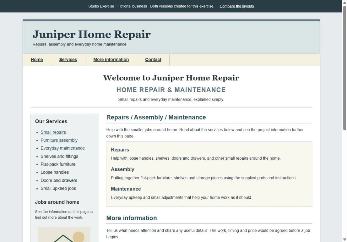
Competing headings, dense service copy, and fixed desktop columns. The contact section sits near the bottom of the page.
Studio Exercise / Website redesign
Same business idea. A more organized page.
A before-and-after exploration of hierarchy, typography, mobile layout, and a clear contact action for a fictional home-maintenance business.
Fictional business. Both versions created for this exercise. Pinebox built the dated layout and the redesign. This was not commissioned client work, and no measured results are claimed. The demo inquiry forms are disabled.
The desktop comparison
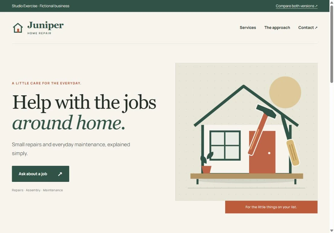
Both pages describe the same repairs, assembly, and maintenance services. These are screenshots of the actual working layouts, shown at the same scale.
Competing headings, dense service copy, and fixed desktop columns. The contact section sits near the bottom of the page.
One introductory heading, three service groups, and an early inquiry button. Cream, pine, rust, and an original tool illustration give Juniper its own identity.
The same pages, on a phone
The before layout keeps its desktop proportions and shrinks the content. The redesign gives the introduction, inquiry button, and service cards their own space in a single column.
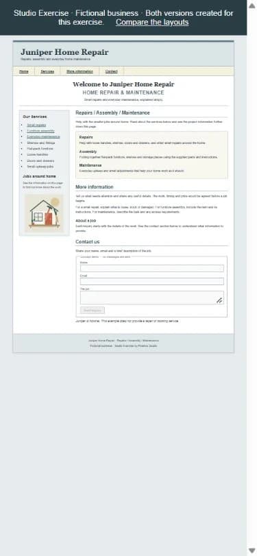
Desktop columns, squeezed into a phone.
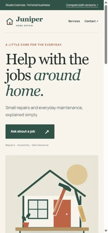
A readable introduction and a clear next step.
The design decisions
01
One heading explains the offer. Repairs, assembly, and maintenance follow in three distinct groups.
02
Serif headings and a consistent body-text scale give each piece of information a clear role.
03
The content stacks into a single column instead of squeezing the desktop layout into a phone.
04
Ask about a job appears directly after the introduction and leads to the illustrative inquiry section.
Both demos request the same inquiry details: name, email, and the job. No messages are sent, and Juniper does not provide a real repair or booking service.
Open the full comparisonTell us about your business and what you need your website to make clear.